Tutorial 4 — Evaluating a design intervention
Pedestrianizing Main Street in Cambridge, MA
Tutorials 2 and 3 measured accessibility and flow across a fixed network. This tutorial evaluates a specific urban-design intervention against a real-world baseline, introducing five capabilities:
Observer points — passive counters snapped to the network; they don’t affect routing, they just record how many trips pass by. “How many pedestrians would walk past my proposed café?”
Custom network cost columns — routing on a scenario cost column (
PercLenMainSt) instead ofGeometriclength.Scenario comparison — a systematic before-and-after workflow.
Directional flow —
flow_return_directional=Trueseparates A→B from B→A flow on every edge.Node flow —
flow_compute_node_flow=Truegives per-intersection flow for ranking the busiest crossings.
The running example: pedestrianize Main Street across the heart of the MIT campus, between Ames Street and the Wadsworth Street / Broadway intersection — removing through-traffic from a 330 m corridor and turning it into a pedestrian-priority spine linking Kendall Square, the MBTA Red Line stop, and the MIT academic quads.
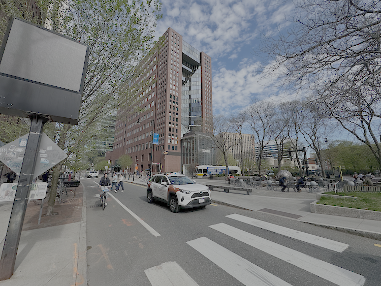
Main Street, looking from the Wadsworth Street / Broadway intersection towards Ames Street. Photo by Andres Sevtsuk.
Data files (in docs/Boston/ (in the UNA repository)): the baseline network
(20260703_PercLenNetwork_InnerCore.geojson, whose PercLenMainSt
column carries the scenario’s perceived costs on the five corridor
segments), the pedestrianized-scenario network
(tut4_network_pedestrianized.geojson), all 14,751 Cambridge
building centroids with population and jobs
(Cambridge_building_centroids_pop2020_jobs2023.geojson), the
transit stops near the corridor
(Cambridge_transit_stations_MainSt800m_buffer.geojson), and 7
candidate business locations along Main St
(tut4_observers_main_st.geojson).
Note
This tutorial uses the aggregate-flow engine — the v2.5.5 default (see Aggregate flow (gradient-overlap method) and Tutorial 3, step i). It scales to all 14,751 Cambridge buildings in seconds, with no need for the building sample that a path-enumeration run would require.
(a) The intervention area
The Main Street corridor between Ames Street and the Wadsworth Street / Broadway intersection consists of 5 network segments, 330.0 m in total:

The pedestrianization stretch of Main Street (outlined in red), from the Ames Street junction on the west to the Wadsworth Street / Broadway intersection on the east.
The scenario’s perceived-cost model is deliberately simple. At
baseline, walking Main Street feels like what it measures: the
perceived length of every corridor segment equals its geometric
length (routing on Geometric). The pedestrianized scenario
assumes the redesigned street feels one-third shorter: a
PercLenMainSt cost column assigns each corridor segment a
perceived length of ⅔ × geometric length, while every other edge in
the network keeps its geometric length. Any flow difference between
the two runs is therefore attributable to the intervention alone.
Segment (west → east) |
Geometric length (= baseline perceived) |
Pedestrianized |
|---|---|---|
1 — at Ames St |
94.3 m |
63 m |
2 |
74.1 m |
49 m |
3 |
79.0 m |
53 m |
4 |
45.8 m |
31 m |
5 — at Wadsworth / Broadway |
36.7 m |
24 m |
Total |
330.0 m |
220.0 m (−33 %) |
The street doesn’t move — but its perceived cost drops by a third, making it a lower-friction connector between the MIT campus end and Kendall Square.
The analysis targets the transit stops that could plausibly route
walkers over this corridor: all stops of
Cambridge_transit_stations.geojson — bus stops as well as metro
stations, each weighted by weekly_departures — that lie within
800 m of the five corridor segments. The service levels are very
uneven: the largest red circle in the figure below is the Kendall/MIT
Red Line station, with over 3,000 departures per week, while the
surrounding bus stops offer 145–360 departures per week each. This
one-time script carves out the subset (17 stops: 16 bus stops and the
Kendall/MIT Red Line station):
import geopandas as gpd

net = gpd.read_file("Boston/20260703_PercLenNetwork_InnerCore.geojson")
corridor = net[net["PercLenMainSt"].notna()]          # the 5 Main St segments
buffer_800 = corridor.geometry.union_all().buffer(800)

stops = gpd.read_file("Boston/Cambridge_transit_stations.geojson")
subset = stops[stops.geometry.within(buffer_800)]
subset.to_file("Boston/Cambridge_transit_stations_MainSt800m_buffer.geojson",
               driver="GeoJSON")

Transit stops around the corridor, sized and labeled by
weekly_departures. The Kendall/MIT Red Line station (3,002
weekly departures) dominates, flanked by bus stops with 145–360
departures each — the weights that drive Huff destination choice
in the flow model.
(b) Baseline — flow with Geometric cost
What trips are we modeling? Walking trips between Cambridge
buildings and nearby transit stops — the first/last-mile walk of a
typical transit commute, modeled one-way from buildings to stops.
Each building generates trips in proportion to its combined
residents-plus-jobs weight (Jobs_Residents), so both the home end
and the work end of transit trips are represented. Trip generation is
tempered by how much transit service a building can actually reach:
with flow_decay_method = "gravity_cap", a building whose
distance-decayed stop access reaches flow_gravity_cap generates
its full trip volume, and buildings with weaker access generate
proportionally less. The cap is set to 5000 — deliberately near
the top of the study area’s access distribution (the best-served
buildings by the Kendall headhouse measure ≈5,200–5,700 in
distance-decayed weekly_departures; the corridor-area mean is
≈3,500). Only the best-served buildings therefore generate their full
volume; a building measuring 2,500 generates half its weight. This
makes trip generation elastic to access: when an intervention
shortens perceived distances, nearby buildings don’t just re-route
their trips — they generate more of them, as better-connected places
do. Generated trips are split among the reachable stops by
Huff-model destination choice — closer stops and stops with more
weekly_departures attract larger shares — and the aggregate-flow
engine then spreads each building–stop trip across every route
within a 20 % detour of the shortest path, concentrating volume near
the shortest route. Only stops within an 800 m network walk count, so
this is deliberately a short-walk model: the flows below represent
transit-bound foot traffic, not all pedestrian activity.
from urban_network_analysis import UNA
una = UNA()

una.settings.data_folder           = r"Boston"
una.settings.network_file          = "20260703_PercLenNetwork_InnerCore.geojson"
una.settings.network_weight_column = "Geometric"       # baseline: perceived = geometric
una.settings.flow_engine           = "aggregate_flow"  # the v2.5.5 default, stated explicitly
una.settings.origins_file          = "Cambridge_building_centroids_pop2020_jobs2023.geojson"
una.settings.origin_weight_column  = "Jobs_Residents"
una.settings.destinations_file     = "Cambridge_transit_stations_MainSt800m_buffer.geojson"
una.settings.destination_weight_column = "weekly_departures"
una.settings.search_radius         = 800

una.settings.flow_decay          = True
una.settings.gravity_beta        = 0.001
una.settings.flow_decay_curve    = "exponential"
una.settings.flow_decay_method   = "gravity_cap"
una.settings.flow_gravity_cap    = 5000.0
una.settings.flow_detour_ratio   = 1.2
una.settings.flow_origin_weights      = True
una.settings.flow_destination_weights = True

una.RunFlow()
Metric |
Value |
|---|---|
Trips generated (all origins) |
33,137 |
Max edge flow on 5 Main St segments |
11,054.3 |
Edges with flow > 0 |
880 |
This is the before condition: every street feels exactly as long as it is, and building-to-transit trips route accordingly. (Flow units are origin-weight units — persons per building — so values on busy edges are large; what matters is the before/after comparison.)

Baseline flows around the intervention area, labeled per edge. The busiest Main Street segment (11,054) is the block by the Kendall/MIT headhouse (large red circle); corridor flows taper toward Ames Street and Wadsworth/Broadway, while heavy volumes also follow Main Street west of Ames and the parallel approach streets feeding the station.
(c) Add 7 observer points along Main St
Seven observers are placed strategically around the intervention area: on the corridor itself (the Kendall/MIT entrance block and eastern Main St), on the approach streets that feed it (Main St west of Ames, Third St, Hockfield Court), and on the parallel streets that compete with it (Carleton St to the south, Broadway to the north). Observers snap to their nearest edge and report that edge’s flow — they never affect routing.

The seven observer locations (green points) around the intervention area, labeled with their baseline flow counts: Obs3 and Obs6 on the corridor itself (11,054 and 5,463), Obs1, Obs2 and Obs5 on its approach streets, and Obs4 (Carleton St) and Obs7 (Broadway) on the parallel streets competing with it.
una.settings.observer_points_file       = "tut4_observers_main_st.geojson"
una.settings.observer_points_uid_column = "observer_id"

una.RunFlow()
Baseline observer counts (Geometric cost, no intervention):
Observer |
Location |
Baseline flow |
|---|---|---|
Obs1_HockfieldCourt |
Hockfield Court, west of Ames St |
352.9 |
Obs2_WestMain |
Main St, west of Ames St (approach) |
4,129.5 |
Obs3_KendallMIT_Entrance |
Corridor, Kendall/MIT entrance block |
11,054.3 |
Obs4_CarletonSt |
Carleton St, south of the corridor (parallel) |
473.3 |
Obs5_ThirdSt |
Third St, northeast of Wadsworth / Broadway (approach) |
4,304.1 |
Obs6_EastMain |
Corridor, eastern Main St |
5,463.0 |
Obs7_Broadway |
Broadway, north of the corridor (parallel) |
220.6 |
TOTAL |
25,997.7 |
Baseline foot traffic peaks on the corridor block at the Kendall metro entrance, the approach streets carry substantial volumes, and the parallel side streets carry little. These seven numbers are the comparison baseline.
(d) Build the pedestrianized network
The PercLenMainSt column in the baseline network carries values
only on the five corridor segments (⅔ × geometric length). To route
on it, every other edge needs a cost too — its geometric length. This
one-time script fills the column and writes the scenario network:
import geopandas as gpd

net = gpd.read_file("Boston/20260703_PercLenNetwork_InnerCore.geojson")

# PercLenMainSt is authored on the 5 Main St segments only;
# every other edge keeps geometric length as its routing cost.
fill = net["PercLenMainSt"].isna()
net.loc[fill, "PercLenMainSt"] = net.loc[fill].geometry.length

net.to_file("Boston/tut4_network_pedestrianized.geojson", driver="GeoJSON")
(e) Re-run flow on the pedestrianized network
una.settings.network_file          = "tut4_network_pedestrianized.geojson"
una.settings.network_weight_column = "PercLenMainSt"
una.RunFlow()
Metric |
Baseline (b) |
Pedestrianized (e) |
Δ |
|---|---|---|---|
Trips generated (all origins) |
33,137 |
34,212 |
+3.2 % |
Sum flow on 5 Main St segments |
30,634.1 |
34,430.2 |
+12.4 % |
Both rows move, for different reasons. The study area generates about 1,075 more walking trips (+3.2 %): with the gravity cap binding, trip generation is elastic to access, so buildings near the corridor see their distance-decayed transit access rise and generate more trips — and a few additional buildings enter transit-oriented walking trip generation range altogether, because the cheaper perceived corridor stretches how far their 800 m budget reaches. Flow on the corridor itself grows four times faster (+12.4 %) than trip generation, because two effects stack: redistribution (trips choosing Main St over parallel routes) and induced generation (more trips overall). The observer table next shows where along the corridor each effect lands.

Pedestrianized-scenario flows at the seven observers. The corridor observers rise to 12,108 and 5,994, and the approach streets to 4,591 and 4,605 — while the parallel streets fall to 382 (Carleton St) and 151 (Broadway). Compare with the baseline map in step (c).
(f) Observer comparison — the money table
Observer |
Baseline |
Pedestrianized |
Δ % |
|---|---|---|---|
Obs1_HockfieldCourt |
352.9 |
375.1 |
+6 % |
Obs2_WestMain |
4,129.5 |
4,591.2 |
+11 % |
Obs3_KendallMIT_Entrance |
11,054.3 |
12,107.5 |
+10 % |
Obs4_CarletonSt |
473.3 |
382.2 |
−19 % |
Obs5_ThirdSt |
4,304.1 |
4,604.9 |
+7 % |
Obs6_EastMain |
5,463.0 |
5,994.3 |
+10 % |
Obs7_Broadway |
220.6 |
150.8 |
−32 % |
TOTAL |
25,997.7 |
28,206.0 |
+8.5 % |
The table separates the intervention’s two effects cleanly. The corridor blocks gain about 10 % (Kendall entrance +10 %, eastern Main St +10 %), and the approach streets feeding the corridor gain 6–11 % — partly rerouted trips, partly the induced generation from step (e). Meanwhile the parallel streets lose flow outright: Carleton St −19 % and Broadway −32 %, as trips that used to bypass Main Street now prefer the cheaper pedestrianized corridor. This is redistribution made visible — the corridor’s gain is partly its neighbors’ loss, which is exactly what a planning board needs to see: who gains foot traffic, who loses it, and by how much. A perceived-cost reduction of one-third produces a measurable but realistic effect; try steeper factors to see the sensitivity.
(g) Directional flow
The UNA flow engine can not only estimate total flow on network edges or observer points — it can also differentiate directional flows on each segment. This matters because edge flows can be asymmetric: the two directions of the same block often carry very different volumes. Real-world pedestrian counts frequently distinguish directionality too, so directional estimates can be calibrated against directional counts when building pedestrian volume models.
una.settings.flow_return_directional = True
una.RunFlow()
Directional flow on the five corridor segments (west → east):
Segment |
A→B |
B→A |
Total |
|---|---|---|---|
1 — at Ames St |
954.8 |
4,912.8 |
5,867.6 |
2 |
6,886.5 |
5,221.0 |
12,107.5 |
3 |
6,879.2 |
2,249.2 |
9,128.4 |
4 |
5,989.1 |
5.1 |
5,994.3 |
5 — at Wadsworth / Broadway |
1,133.0 |
199.4 |
1,332.4 |
A→B and B→A follow each edge’s digitized direction (A is the start of the segment geometry). Segment 2 — second from the Ames end — carries the corridor’s highest flow (12,107.5) and both directional maxima, with a moderate 57/43 asymmetry (6,886.5 vs 5,221.0). The asymmetry grows sharply toward the east: segment 4 is almost entirely one-way in the model. Because the modeled trips run one way, from buildings to transit stops, these splits reveal which direction the transit-bound stream flows on each block — information a symmetric flow map cannot provide, and useful when sizing sidewalks or planning a one-way pedestrian street design. Without directional flow the symmetric result just says “corridor is busy” without saying which direction dominates — useful when sizing sidewalks or planning a one-way pedestrian street design.
(h) Node flow — busiest intersections
The UNA flow engine can additionally record total flow (not directional) at each of the network nodes. This can be useful for comparing foot-traffic or bike-traffic volume estimates with node-level benchmarks — observed total pedestrian counts at intersections, pedestrian crash records at intersections, vehicular traffic volumes at intersections, and the like.
una.settings.flow_compute_node_flow = True
una.RunFlow()
Metric |
Value |
|---|---|
Total nodes within 800 m study area of the 5 Main Street intervention segments |
358 |
Mean node flow in 800 m study area |
506.1 |
Mean node flow along 5 Main Street intervention segments |
5,621.4 |
Max node flow along 5 Main Street intervention segments |
7,365.6 |
Node flow follows the same long-tailed distribution as edge flow: the six intersections along the corridor average more than ten times the study-area mean, with the busiest node — 7,365.6, the network-wide maximum — at the Kendall Square transit cluster.
Note that the corridor’s max node flow (7,365.6) is well below its max edge flow (12,107.5). This is not an inconsistency — the two metrics count different things. Edge flow counts every trip that uses any part of a segment, including trips that begin or end mid-segment where an origin or destination snaps onto it. Node flow counts only trips that pass through an intersection. The Kendall/MIT station snaps onto the busiest corridor segment mid-block, so the large volume alighting at (or departing from) the station loads that edge without ever crossing the junctions at its ends. Edge flow answers “how many people walk on this block” (storefront exposure); node flow answers “how many people move through this crossing” (signal and crosswalk demand). For planning purposes, junctions like the corridor’s are where signal-timing and crosswalk investment belongs; comparing against the baseline identifies which junctions get busier under the pedestrianization.
What we covered
A clean scenario design (a) — baseline perceived cost equal to geometric length, intervention reducing it by one-third on five segments — made every flow change attributable to the intervention, with all 14,751 Cambridge buildings routed to the 17 bus and metro stops near the corridor by the aggregate-flow engine, and a gravity cap of 5000 making trip generation elastic to access. Observer points (c, f) produced the before/after money table (+10 % on the corridor and its approaches, −19 % to −32 % on the parallel streets it drains); the scenario workflow (d–f) turned a design proposal into a quantified planning brief; directional flow (g) exposed the one-way asymmetry; node flow (h) ranked the busiest junctions.
Try the same framework on other proposals — pedestrianizing the Kendall/Broadway intersection, a mid-block crossing on Massachusetts Ave, a parking lot converted to a plaza. Identify the affected segments, author a scenario cost column (or add obstacle points), place observers at candidate locations, run baseline vs scenario, and compare the observer table. Every setting here composes freely with Tutorials 2 and 3 — including turns, elevation, and the ten-category composite via the pairings CSV workflow.